1. Set Up
1.1 Introduction
There are a number of forecasting packages written in R to choose from, each with their own pros and cons.
For almost a decade, the forecast library from the fpp2 forecasting framework has been a major force in the time series world. However, within the last year or so an official update has been released. This new fpp3 framework utilizes a package called fable that follows tidy methodology as opposed to using base R code.
More recently, the modeltime library has been released and this also follows tidy methods. It has a companion package timetk for data manipulation and visualization which is also written by the same author.
The following is a code comparison of various time series visualizations between these frameworks: fpp2, fpp3 and timetk/modeltime.
1.2 Load Libraries
# Load libraries
library(fpp2)         # The OG of forecasting
library(fpp3)         # Official update to fpp2
library(timetk)       # Companion to modeltime
library(tidyverse)    # Data manipulation tools
library(cowplot)      # Add-on for arranging plots
2. Convert Time Series Objects
- The base ts object is used by
forecast&fpp2 - The special
tsibbleobject is used byfable&fpp3 - The standard
tibbleobject is used bytimetk&modeltime
2.1 Load Data
For the next few visualizations, we will utilize a dataset containing quarterly production values of certain commodities in Australia.
# Quarterly Australian production data as tibble
aus <- tsibbledata::aus_production %>% as_tibble()

# Check structure
aus %>% str()
## tibble [218 × 7] (S3: tbl_df/tbl/data.frame)
##  $ Quarter    : qtr [1:218] 1956 Q1, 1956 Q2, 1956 Q3, 1956 Q4, 1957 Q1, 1957 Q2, 1957...
##  $ Beer       : num [1:218] 284 213 227 308 262 228 236 320 272 233 ...
##  $ Tobacco    : num [1:218] 5225 5178 5297 5681 5577 ...
##  $ Bricks     : num [1:218] 189 204 208 197 187 214 227 222 199 229 ...
##  $ Cement     : num [1:218] 465 532 561 570 529 604 603 582 554 620 ...
##  $ Electricity: num [1:218] 3923 4436 4806 4418 4339 ...
##  $ Gas        : num [1:218] 5 6 7 6 5 7 7 6 5 7 ...
Always check the class of your time series data.
2.2 fpp2 Method: tibble to ts
# Convert tibble to time series object
aus_prod_ts <- ts(aus[, 2:7],  # Choose columns
                    start = c(1956, 1),  # Choose start date
                    end = c(2010, 2),    # Choose end date
                    frequency = 4)       # Choose frequency per yr
# Check it out
aus_prod_ts %>% head()
##         Beer Tobacco Bricks Cement Electricity Gas
## 1956 Q1  284    5225    189    465        3923   5
## 1956 Q2  213    5178    204    532        4436   6
## 1956 Q3  227    5297    208    561        4806   7
## 1956 Q4  308    5681    197    570        4418   6
## 1957 Q1  262    5577    187    529        4339   5
## 1957 Q2  228    5651    214    604        4811   7
2.3 fpp3 Method: tibble/ts to tsibble
# Convert ts to tsibble, keep wide format
aus_tsbl_wide <- aus_prod_ts %>%    # TS object
  as_tsibble(index = "index",           # Set index column
             pivot_longer = FALSE)      # Wide format

# Check it out
aus_tsbl_wide %>% head()
## # A tsibble: 6 x 7 [1Q]
##     index  Beer Tobacco Bricks Cement Electricity   Gas
##     <qtr> <dbl>   <dbl>  <dbl>  <dbl>       <dbl> <dbl>
## 1 1956 Q1   284    5225    189    465        3923     5
## 2 1956 Q2   213    5178    204    532        4436     6
## 3 1956 Q3   227    5297    208    561        4806     7
## 4 1956 Q4   308    5681    197    570        4418     6
## 5 1957 Q1   262    5577    187    529        4339     5
## 6 1957 Q2   228    5651    214    604        4811     7
# Convert ts to tsibble, pivot to long format
aus_tsbl_long <- aus_prod_ts %>% # TS object
as_tsibble(index = "index", # Set index column
pivot_longer = TRUE) # Long format
# Check it out
aus_tsbl_long %>% head()
## # A tsibble: 6 x 3 [1Q]
## # Key: key [1]
## index key value
## <qtr> <chr> <dbl>
## 1 1956 Q1 Beer 284
## 2 1956 Q2 Beer 213
## 3 1956 Q3 Beer 227
## 4 1956 Q4 Beer 308
## 5 1957 Q1 Beer 262
## 6 1957 Q2 Beer 2282.4 timetk Method: From tsibble/ts to tibble
# Convert tsibble to tibble, keep wide format
aus_tbl_wide <- tsibbledata::aus_production %>%
    tk_tbl(preserve_index = FALSE) %>%
    mutate(Quarter = as_date(as.POSIXct.Date(Quarter)))

# Check it out
aus_tbl_wide %>% head()
## # A tibble: 6 x 7
##   Quarter     Beer Tobacco Bricks Cement Electricity   Gas
##   <date>     <dbl>   <dbl>  <dbl>  <dbl>       <dbl> <dbl>
## 1 1955-12-31   284    5225    189    465        3923     5
## 2 1956-03-31   213    5178    204    532        4436     6
## 3 1956-06-30   227    5297    208    561        4806     7
## 4 1956-09-30   308    5681    197    570        4418     6
## 5 1956-12-31   262    5577    187    529        4339     5
## 6 1957-03-31   228    5651    214    604        4811     7
# Convert tsibble to tibble, pivot to long format
aus_tbl_long <- tsibbledata::aus_production %>%
tk_tbl(preserve_index = FALSE) %>%
mutate(date = as_date(as.POSIXct.Date(Quarter))) %>%
pivot_longer(cols = c("Beer":"Gas"))
# Check it out
aus_tbl_long %>% head()
## # A tibble: 6 x 4
## Quarter date name value
## <qtr> <date> <chr> <dbl>
## 1 1956 Q1 1955-12-31 Beer 284
## 2 1956 Q1 1955-12-31 Tobacco 5225
## 3 1956 Q1 1955-12-31 Bricks 189
## 4 1956 Q1 1955-12-31 Cement 465
## 5 1956 Q1 1955-12-31 Electricity 3923
## 6 1956 Q1 1955-12-31 Gas 53. Time Series Plots
When analyzing time series plots, look for the following patterns:
- Trend: A long-term increase or decrease in the data; a “changing direction”.
- Seasonality: A seasonal pattern of a fixed and known period. If the frequency is unchanging and associated with some aspect of the calendar, then the pattern is seasonal.
- Cycle: A rise and fall pattern not of a fixed frequency. If the fluctuations are not of a fixed frequency then they are cyclic.
- Seasonal vs Cyclic: Cyclic patterns are longer and more variable than seasonal patterns in general.
3.1 fpp2 Method: Plot Multiple Series On Same Axes
# Using fpp2
aus_prod_ts %>%               # TS object
  autoplot(facets=FALSE) +    # No facetting
  ggtitle("Quarterly Production of Select Australian Commodities")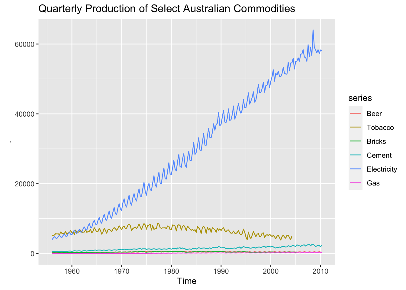
3.2 fpp3 Method: Plot Multiple Series On Same Axes
# Using fpp3
aus_tsbl_long %>%    # Data in long format
  autoplot(value)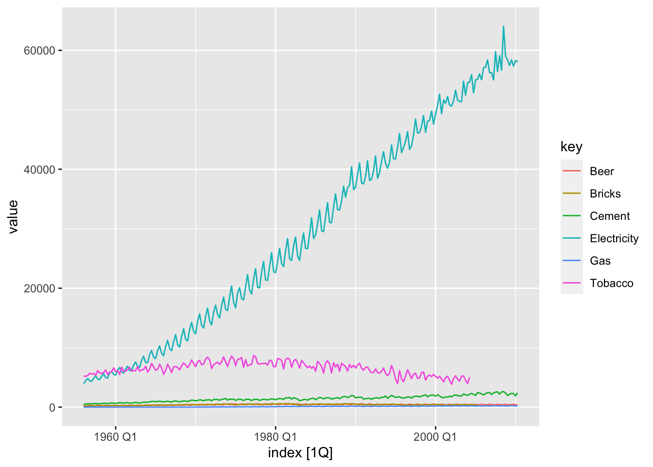
3.3 ggplot Method: Plot Multiple Series On Same Axes
Plots on the same axes is not a feature included in timetk as of this writing. The ggplot & fpp3 methods can be used to achieve the same result.
# Using ggplot
aus_tbl_long %>%
    ggplot(aes(date, value, group = name, color = name)) +
    geom_line()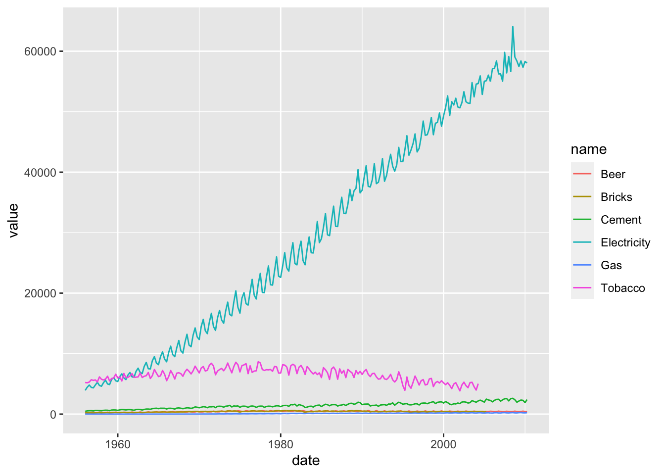
3.4 fpp2 Method: Plot Multiple Series On Separate Axes
# Using fpp2
aus_prod_ts %>%
  autoplot(facets=TRUE)   # With facetting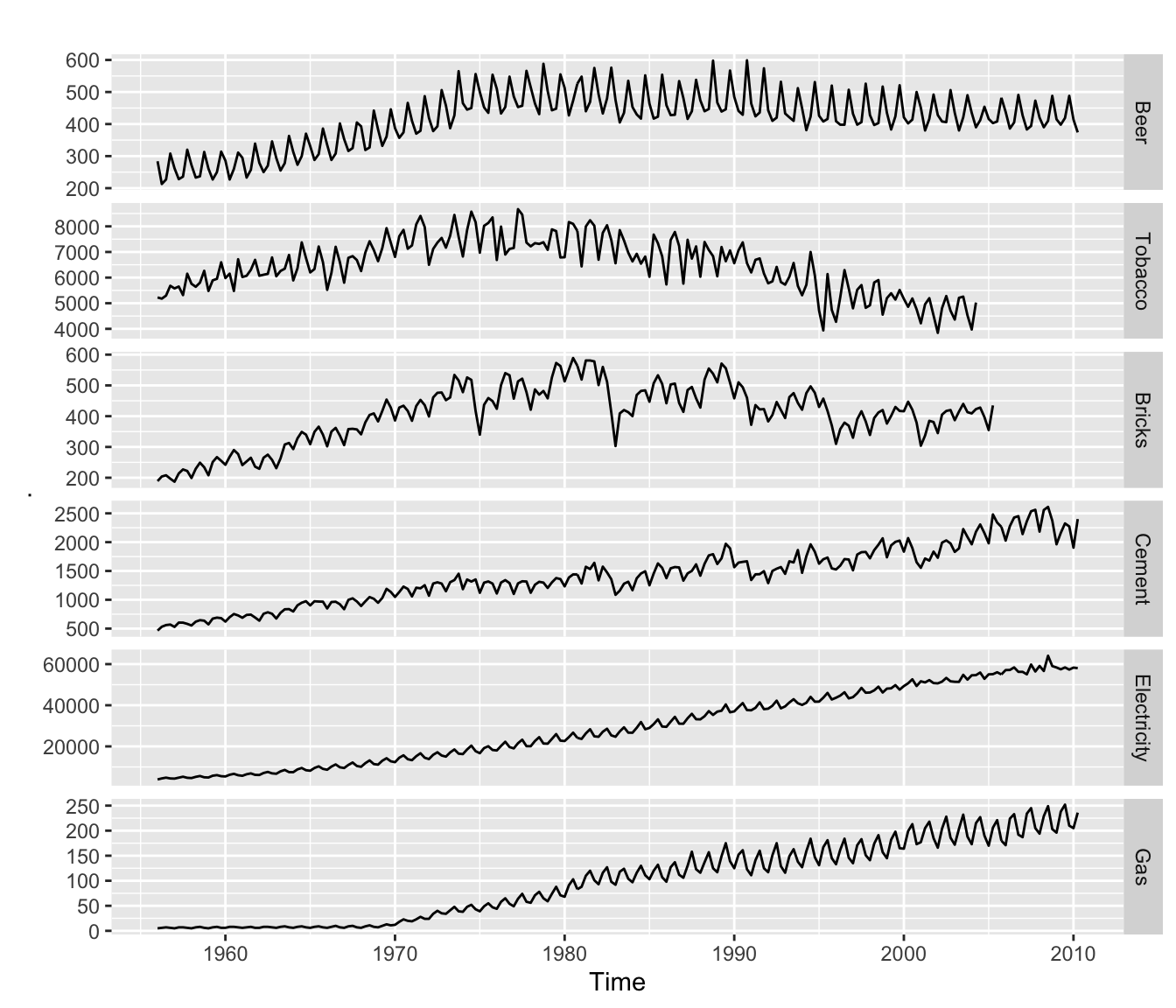
3.5 fpp3 Method: Plot Multiple Series On Separate Axes
# Using fpp3
aus_tsbl_long %>%
  ggplot(aes(x = index, y = value, group = key, color = key)) +
  geom_line() +
  theme(legend.position = "None") +         # Remove legend
  facet_grid(vars(key), scales = "free_y")  # With facetting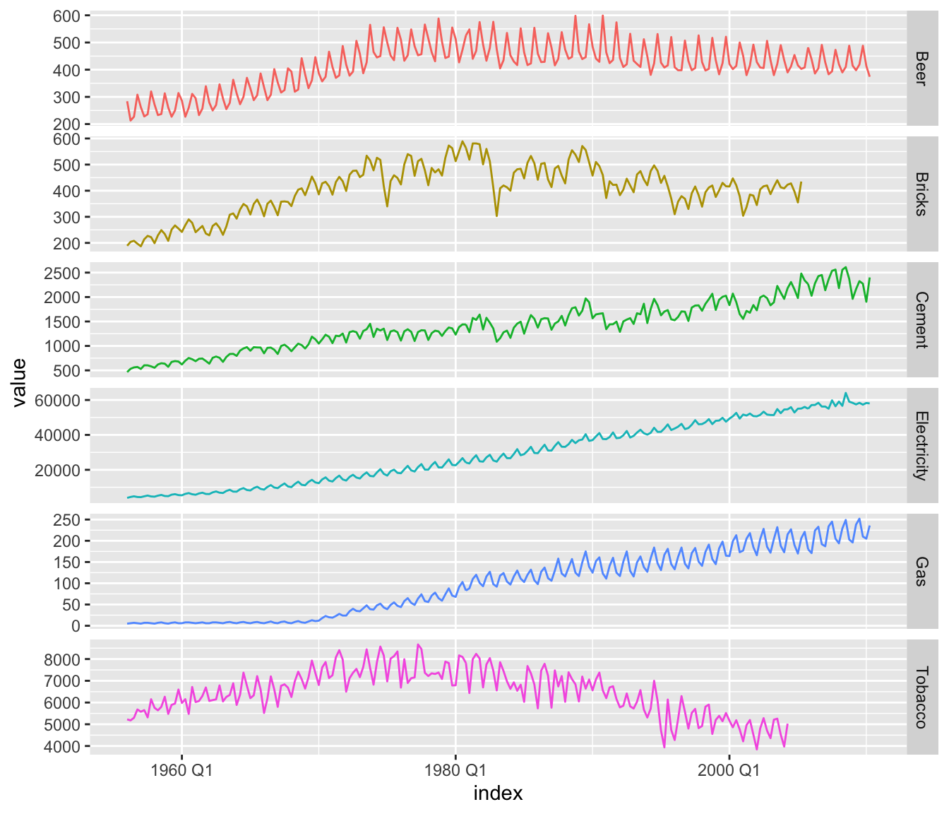
3.6 timetk Method: Plot Multiple Series On Separate Axes
# Using timetk
aus_tbl_long %>%
    plot_time_series(
        .date_var = date,
        .value = value,
        .facet_vars = c(name), # Group by these columns
        .color_var = name,
        .interactive = FALSE,
        .legend_show = FALSE
    )
4. Seasonal Plots
Use seasonal plots for identifying time periods in which the patterns change. The following examples will use a dataset containing the number of anti-diabetic scripts given in Australia over a period of time.
4.1 fpp2 Method: Plot Individual Seasons
# Monthly plot
a1 <- fpp2::a10 %>%
  autoplot()

# Seasonal plot
a2 <- a10 %>%
  ggseasonplot(year.labels.left = TRUE,   # Add labels
               year.labels = TRUE)

# Arrangement of plots
plot_grid(a1, a2, ncol=1, rel_heights = c(1, 1.5))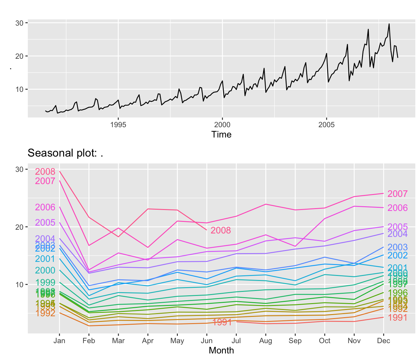
4.2 fpp3 Method: Plot Individual Seasons
# Seasonal plot
a10 %>%
  as_tsibble() %>%
  gg_season(value, labels="both")   # Add labels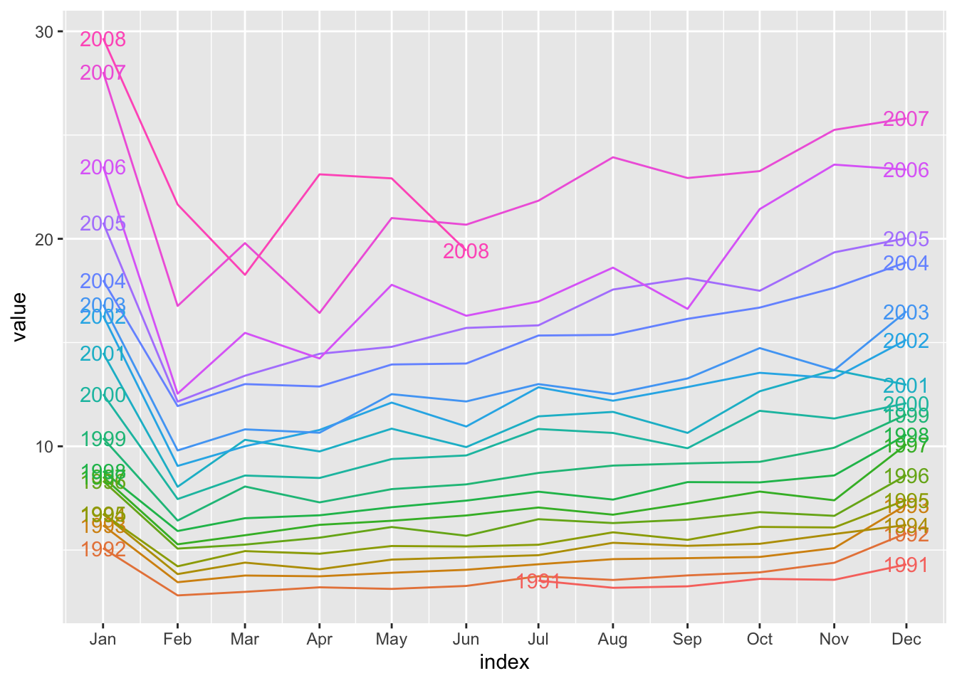
4.3 ggplot Method: Plot Individual Seasons
Plots including each season is not a feature included in timetk as of this writing. The ggplot & fpp3 methods can be used to achieve the same result.
# Convert ts to tibble
a10_tbl <- fpp2::a10 %>%
  tk_tbl()

# New time-based features to group by
a10_tbl_add <- a10_tbl %>%
  mutate(
      month = factor(month(index, label = TRUE)), # x-axis
      year = factor(year(index))  # Grouped on y-axis
  )

# Seasonal plot
a10_tbl_add %>%
  ggplot(aes(x = month, y = value,
             group = year, color = year)) +
  geom_line() +
  geom_text(
    data = a10_tbl_add %>% filter(month == min(month)),
    aes(label = year, x = month, y = value),
    nudge_x = -0.3) +
  geom_text(
    data = a10_tbl_add %>% filter(month == max(month)),
    aes(label = year, x = month, y = value),
    nudge_x = 0.3) +
  guides(color = FALSE) +
  theme_tq() +
  scale_color_tq()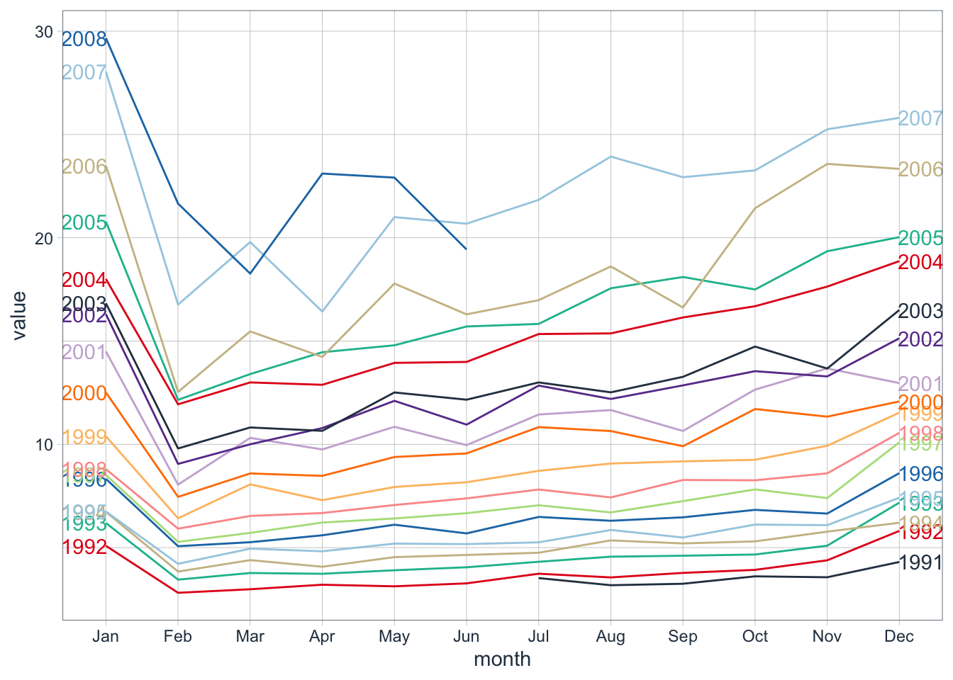
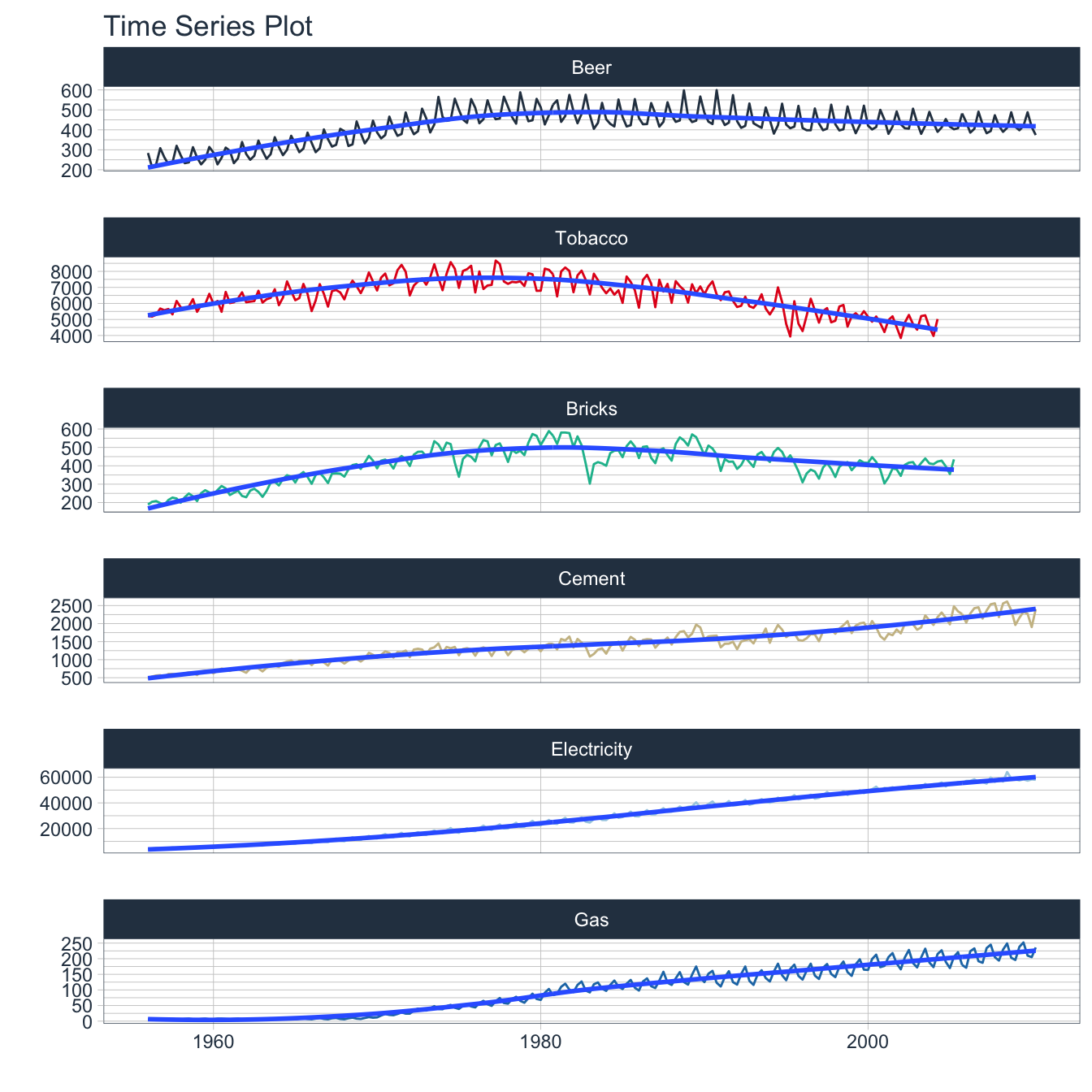
5. Subseries Plots
Use subseries plots to view seasonal changes over time. The following examples will use a dataset containing the monthly production of beer in Australia starting in 1992.
5.1 fpp2 Method: Plot Subseries on Same Axes
# Monthly beer production in Australia 1992 and after
beer_fpp2 <- fpp2::ausbeer %>%
  window(start = 1992)

# Time series plot
b1 <- beer_fpp2 %>%
  autoplot()

# Subseries plot
b2 <- beer_fpp2 %>%
  ggsubseriesplot()

# Plot both
plot_grid(b1, b2, ncol=1, rel_heights = c(1, 1.5))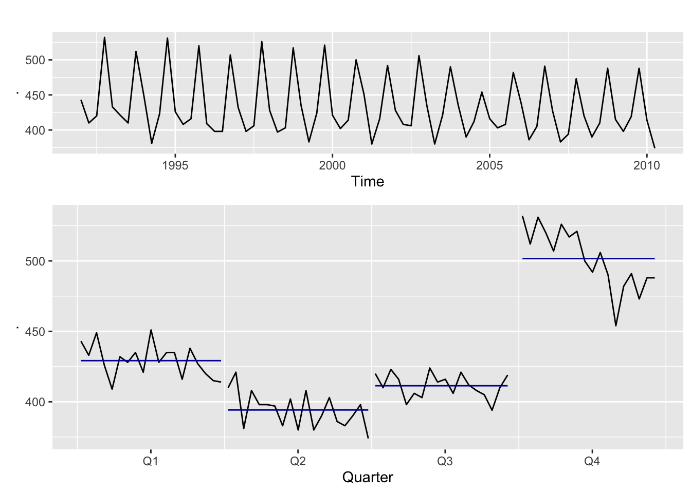
5.2 fpp3 Method: Plot Subseries on Separate Axes
# Monthly beer production in Australia 1992 and after
beer_fpp3 <- fpp2::ausbeer %>%
  as_tsibble() %>%
  filter(lubridate::year(index) >= 1992)

# Time series plot
b3 <- beer_fpp3 %>%
  autoplot(value)

# Subseries plot
b4 <- beer_fpp3 %>%
  gg_subseries(value)

# Plot both
plot_grid(b3, b4, ncol=1, rel_heights = c(1, 1.5))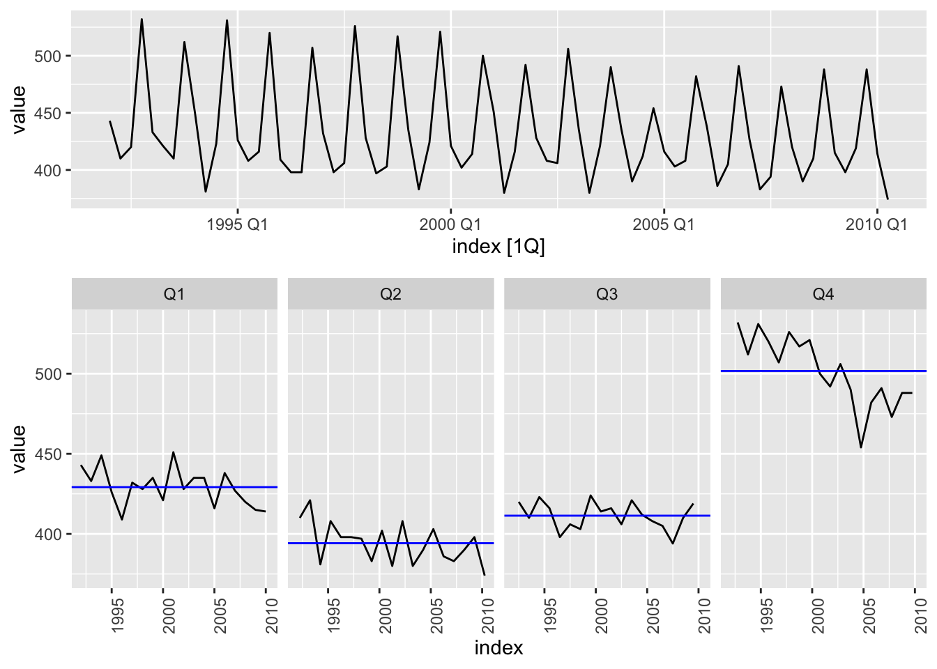
5.3 timetk Method: Plot Subseries on Separate Axes
# Monthly beer production in Australia 1992 and after
ausbeer_tbl <- fpp2::ausbeer %>%
  tk_tbl() %>%
  filter(year(index) >= 1992) %>%
  mutate(index = as_date(index))
# Time series plot
b1 <- ausbeer_tbl %>%
  plot_time_series(
      .date_var = index,
      .value    = value,
      .interactive = FALSE,
      .title = "Monthly Aussie Beer Production"
      )

# Subseries plot
b2 <- ausbeer_tbl %>%
  mutate(
    quarter = str_c("Quarter ", as.character(quarter(index)))
    ) %>%
    plot_time_series(
      .date_var = index,
      .value = value,
      .facet_vars = quarter,
      .facet_ncol = 4,
      .color_var = quarter,
      .facet_scales = "fixed",
      .interactive = FALSE,
      .legend_show = FALSE,
      .title = "Seasonal Plot"
      )

# Plot it
plot_grid(b1, b2, ncol=1, rel_heights = c(1, 1.5))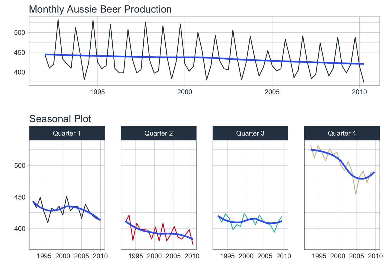
6. Lag Plots
Use lag plots to check for randomness. In particular, look for linear relationships indicating seasonality. The following examples use a dataset containing the annual oil production (millions of tons) in Saudi Arabia. Of interest is that this data is non-seasonal.
6.1 fpp2 Method: Plot Multiple Lags
# Yearly plot
o1 <- fpp2::oil %>%
  autoplot()

# Lag plot
o2 <- gglagplot(oil, do.lines = FALSE) +
  theme(aspect.ratio=0.2)

# Plot both
plot_grid(o1, o2, ncol=1, rel_heights = c(1,2))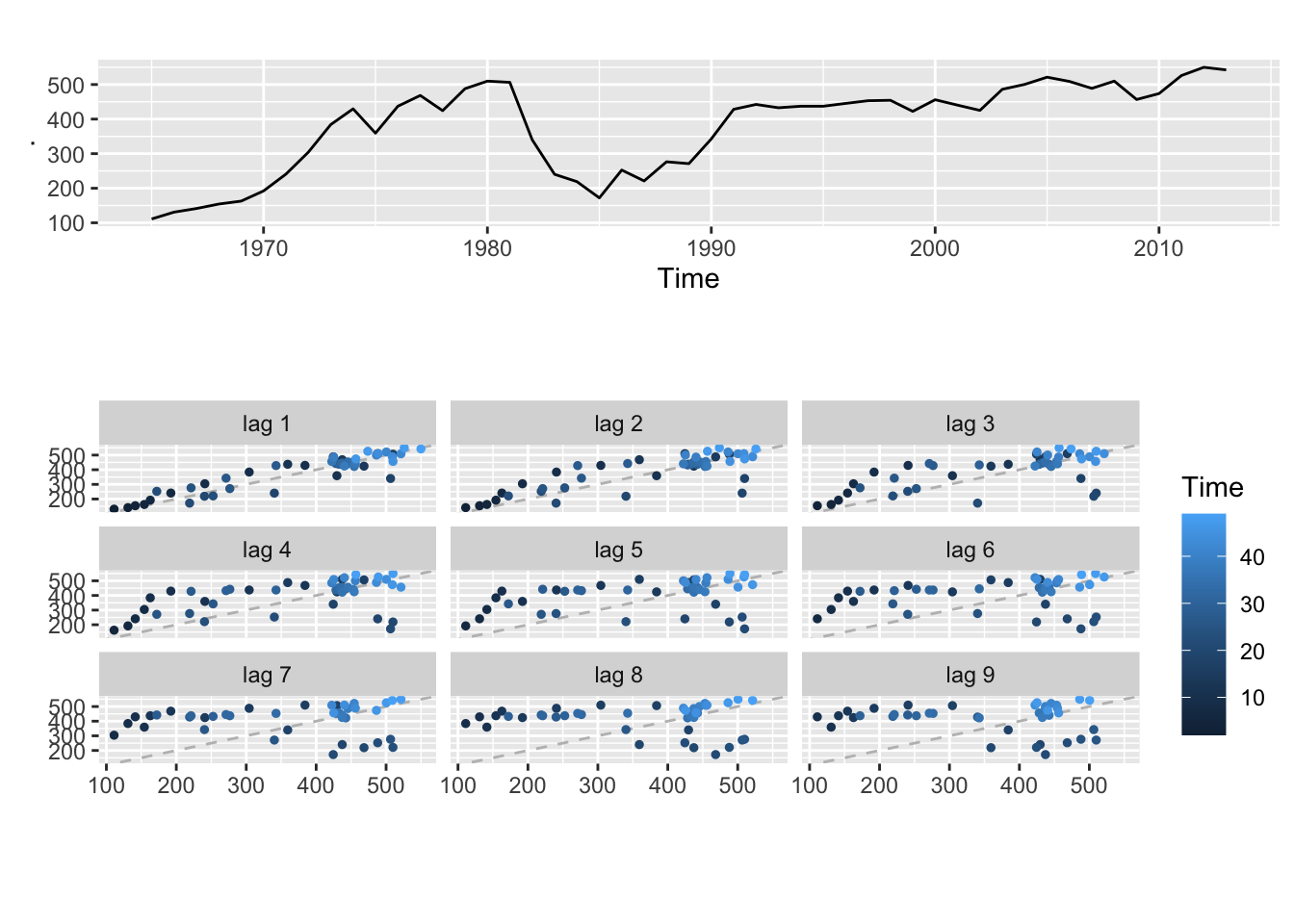
6.2 fpp3 Method: Plot Multiple Lags
# Yearly plot
o1 <- oil %>%
  as_tsibble() %>%
  autoplot(value, color="#0277bd")

# Lag plot
o2 <- oil %>%
  as_tsibble() %>%
  gg_lag(y = value, geom = "point") +
  geom_point(aes(colour=.lag)) +
  theme(aspect.ratio=0.2, legend.position = "None")

# Plot both
plot_grid(o1, o2, ncol=1, rel_heights = c(1,2))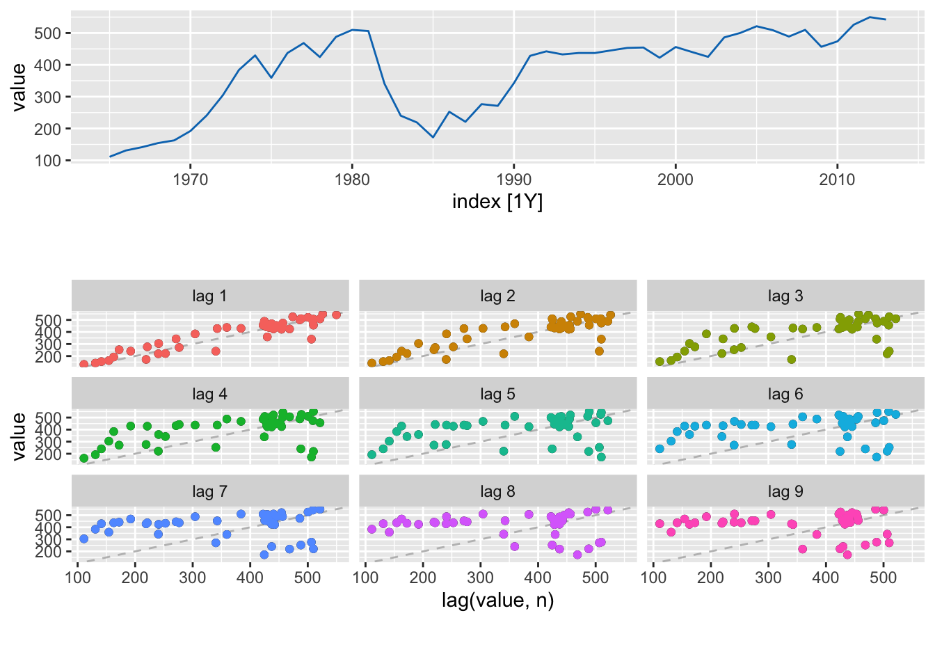
6.3 timetk Method (Hack?): Plot Multiple Lags
# Convert to tibble and augment with lag data
oil_lag_long <- oil %>%
  tk_tbl(rename_index = "year") %>%
  tk_augment_lags(      # Add 9 lag columns of data
      .value = value,
      .names = "auto",
      .lags = 1:9) %>%
  pivot_longer(
      names_to = "lag_id",
      values_to = "lag_value",
      cols = value_lag1:value_lag9)  # Exclude year & value

# Check it out
oil_lag_long %>% tail(9)
## # A tibble: 9 x 4
##    year value lag_id     lag_value
##   <dbl> <dbl> <chr>          <dbl>
## 1  2013  542. value_lag1      550.
## 2  2013  542. value_lag2      526.
## 3  2013  542. value_lag3      474.
## 4  2013  542. value_lag4      457.
## 5  2013  542. value_lag5      510.
## 6  2013  542. value_lag6      489.
## 7  2013  542. value_lag7      509.
## 8  2013  542. value_lag8      521.
## 9  2013  542. value_lag9      500.
Now you can plot
valuevslag_valuefacetted bylag_id.
# Time series plot
o1 <- oil %>%
    tk_tbl(rename_index = "year") %>%
    mutate(year = ymd(year, truncated = 2L)) %>%
    plot_time_series(
        .date_var = year,
        .value = value,
        .interactive = FALSE,
        .title = "Annual Saudi Oil Production")

# Plot Multiple Lags
o2 <- oil_lag_long %>%
    plot_time_series(
        .date_var = value,     # Use value instead of date
        .value = lag_value,    # Use lag value to plot against
        .facet_vars = lag_id,  # Facet by lag number
        .facet_ncol = 3,
        .interactive = FALSE,
        .smooth = FALSE,
        .line_alpha = 0,
        .legend_show = FALSE,
        .facet_scales = "fixed",
        .title = "Lag Plot") +
    geom_point(aes(colour = lag_id)) +
    geom_abline(colour = "gray", linetype = "dashed")

# Plot both
plot_grid(o1, o2, ncol=1, rel_heights = c(1,2))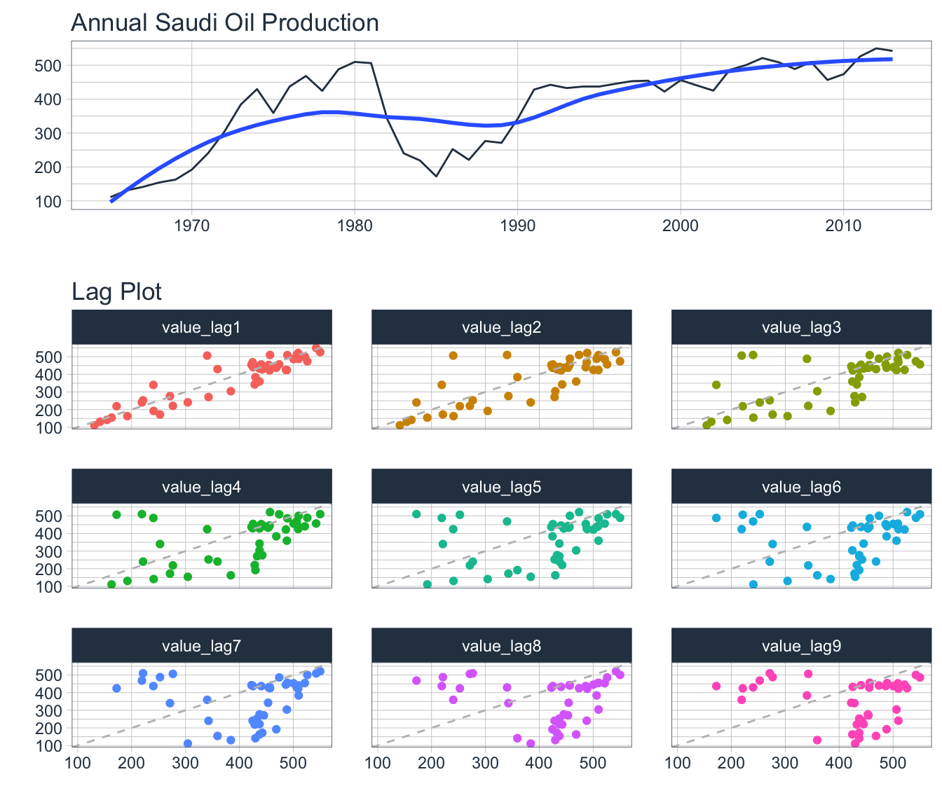
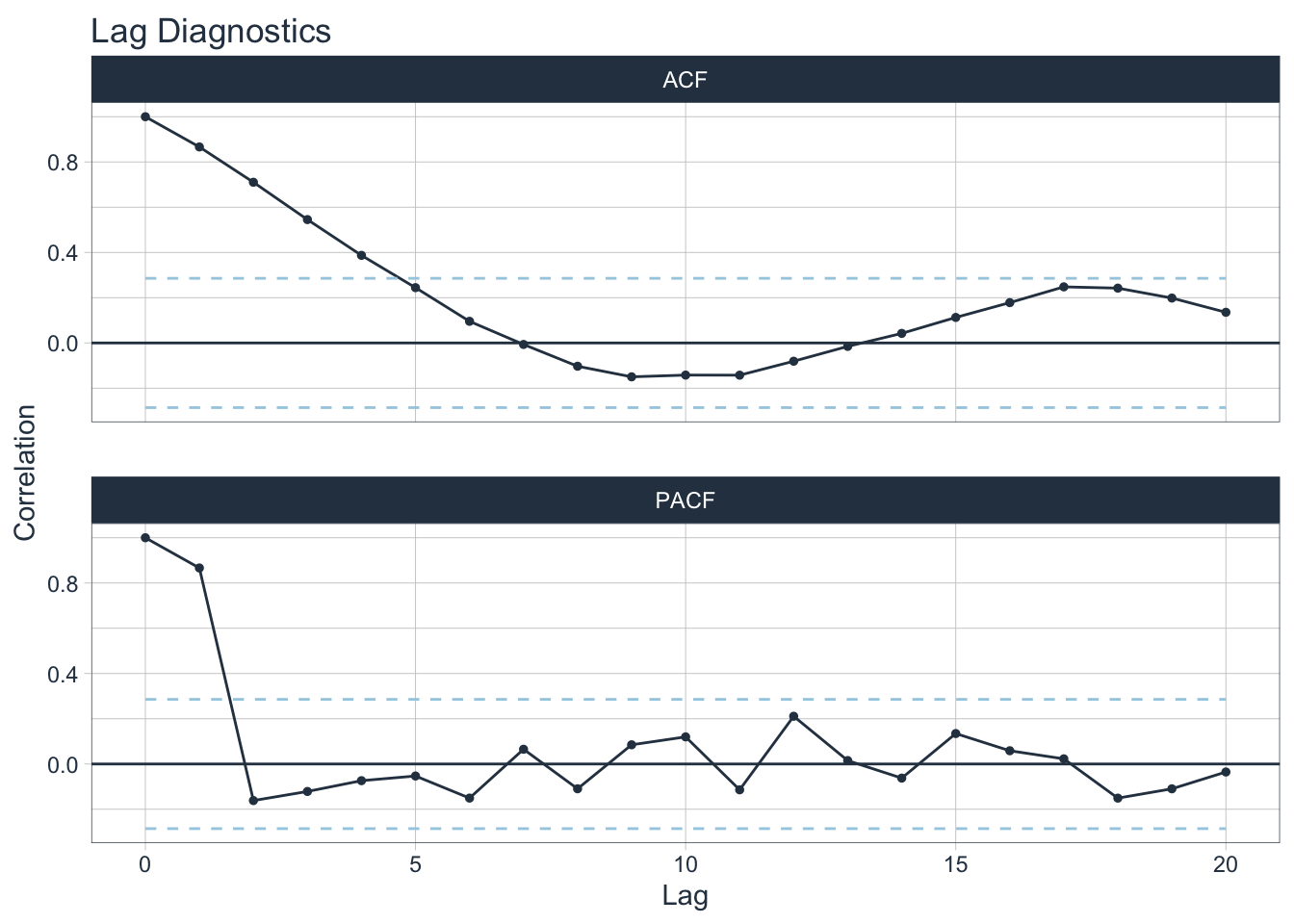
7. Autocorrelation Function Plots
The autocorrelation function measures the linear relationship between lagged values of a time series. The partial autocorrelation function measures the linear relationship between the correlations of the residuals.
ACF
- Visualizes how much the most recent value of the series is correlated with past values of the series (lags)
- If the data has a trend, then the autocorrelations for small lags tend to be positive and large because observations nearby in time are also nearby in size
- If the data are seasonal, then the autocorrelations will be larger for seasonal lags at multiples of seasonal frequency than other lags
PACF
- Visualizes whether certain lags are good for modeling or not; useful for data with a seasonal pattern
- Removes dependence of lags on other lags by using the correlations of the residuals
7.1 fpp2 Method: Plot ACF + PACF
# ACF plot
o1 <- ggAcf(oil, lag.max = 20)

# PACF plot
o2 <- ggPacf(oil, lag.max = 20)

# Plot both
plot_grid(o1, o2, ncol = 1)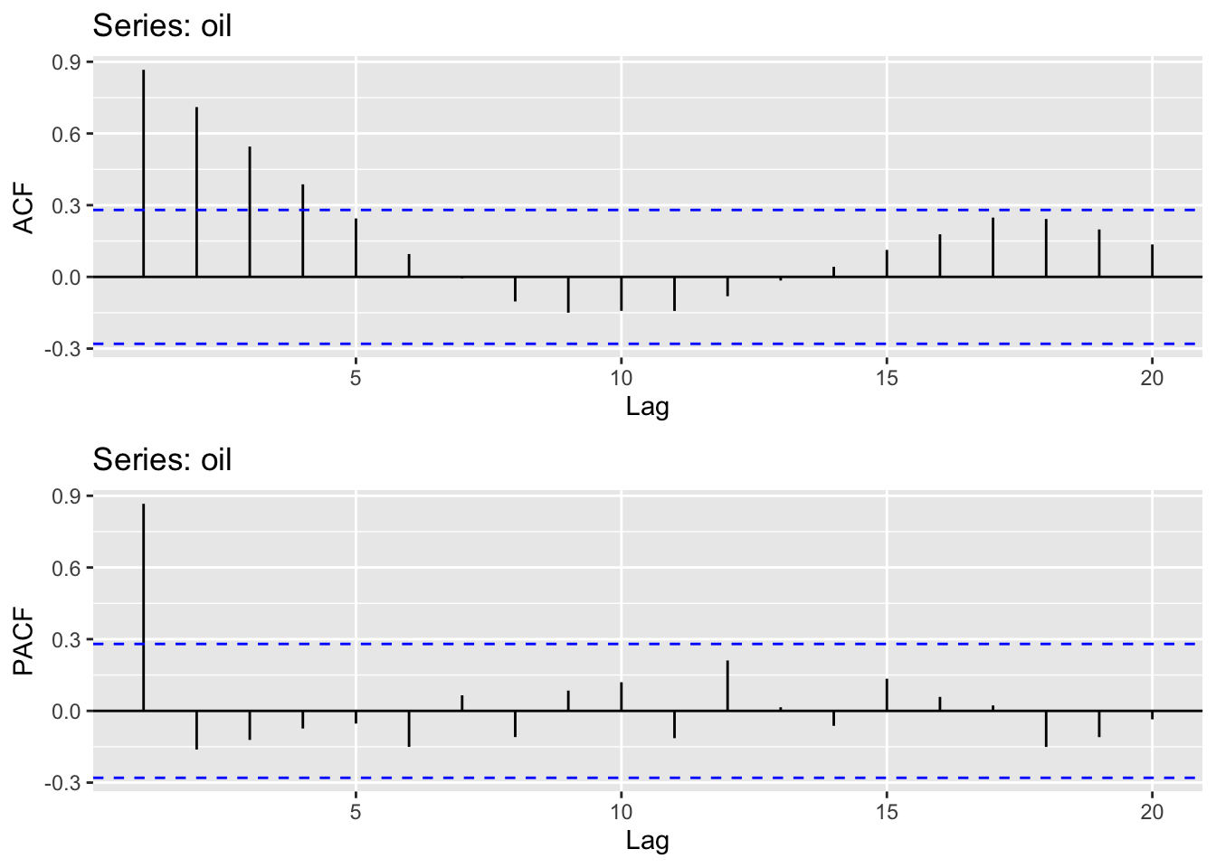
7.2 fpp3 Method: Plot ACF + PACF
# Convert to tsibble
oil_tsbl <- oil %>% as_tsibble()

# ACF Plot
o1 <- oil_tsbl %>%
  ACF(var = value, lag_max = 20) %>%
  autoplot()

# PACF Plot
o2 <- oil_tsbl %>%
  PACF(var = value, lag_max = 20) %>%
  autoplot()

# Plot both
plot_grid(o1, o2, ncol = 1)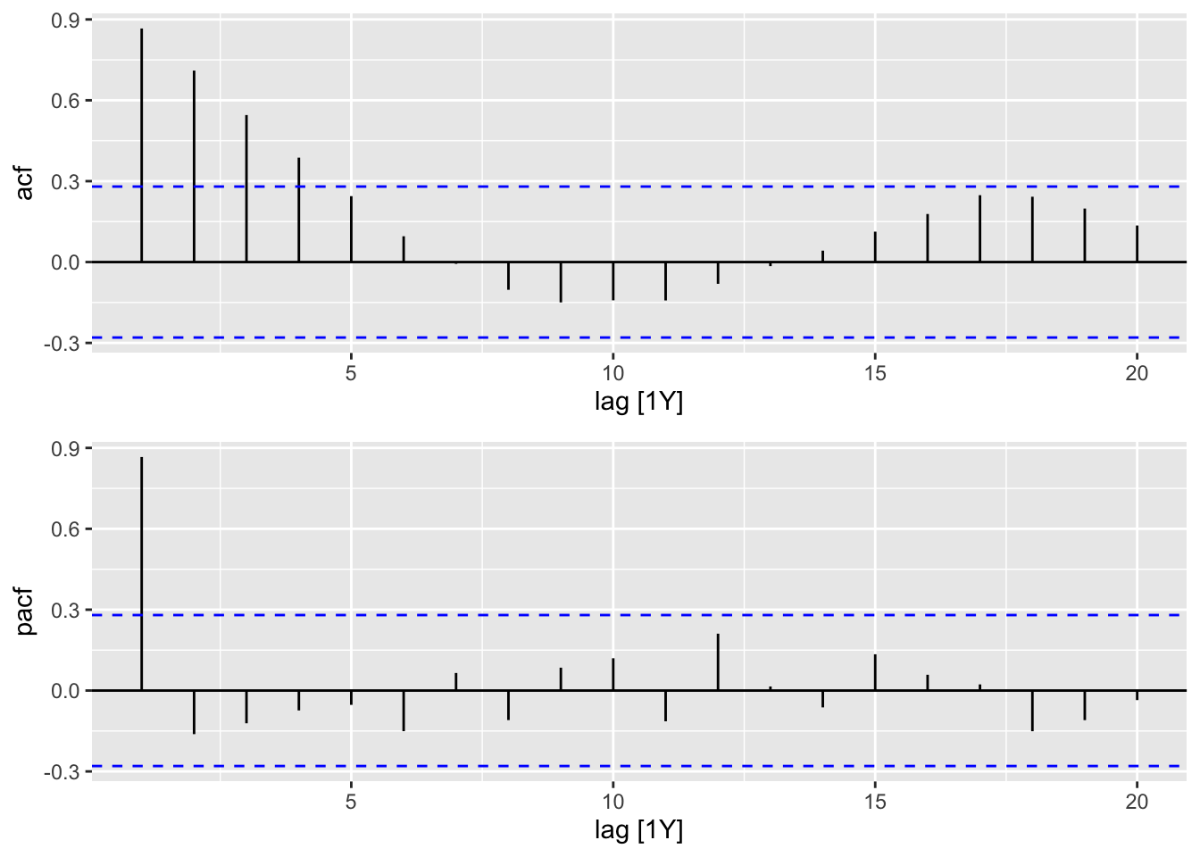
7.3 timetk Method: Plot ACF & PACF
# Using timetk
oil %>%
    tk_tbl(rename_index = "year") %>%
    plot_acf_diagnostics(
        .date_var = year,
        .value = value,
        .lags = 20,
        .show_white_noise_bars = TRUE,
        .interactive = FALSE
    )
8. Summary
Although all three frameworks have similar functionality when it relates to visualizations as they all use ggplot as their foundation, there are some important factors to consider.
A major possible strength or downside of fpp2 is that it uses the older base ts objects. However, it is no longer maintained and the author recommends using fpp3 instead.
The newer fpp3 framework uses similar code to fpp2 but has been updated to work with the tidyverse suite of data manipulation tools. However, I’ve found the tsibble object acts a bit unexpectedly sometimes so I wouldn’t consider it fully compatible with the tidyverse suite. Be especially careful when converting between different time series objects.
The newest contender is modeltime which also works with the tidyverse but is better suited for data manipulation & augmentation with its companion timetk library. It uses the tibble format and can coerce a range of different time series objects (xts, zoo, ts) using function tk_tbl(). One major advantage is that visualizations can be made either static (ggplot) or interactive (plotly).